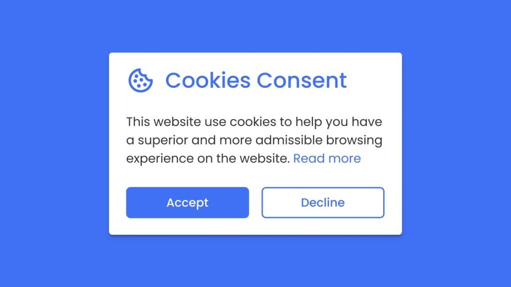
Many of us have encountered sudden pop-ups requesting cookie consent while browsing websites . These web pages require your agreement to set cookies—small files saved to your device—to enable certain functionalities, such as recording your preferences and login status. This often occurs when we open a specific webpage for the first time, register a new account, or click on an advertisement. The cookies you agree to may store some of your privacy settings and track your behavior while you browse the webpage.
The occurrence of these pop-ups is primarily due to the General Data Protection Regulation (GDPR) issued by the European Union in May 2018. The GDPR categorizes cookies as part of user data, leading many websites to implement cookie alerts spontaneously to enhance transparency for users. However, for most of us, we may not read the privacy policies; instead, we mechanically click “accept” to ensure access to the content we genuinely want to browse.
With the increasing number of these pop-ups—regardless of whether they truly inform users about the potential misuse of their data privacy—they undeniably diminish our browsing experience. It seems that no matter which website you visit, there’s always a cookie consent pop-up, which often feels no different from annoying pop-up ads.
To enhance the smoothness and security of users’ web browsing experience, I propose optimizing cookie consent pop-ups on websites. My goal is to explore better ways to ensure that users’ browsing experiences are not disrupted and that they effectively understand the purpose of these cookies and their impact on privacy.
The task involves understanding users’ thoughts and experiences when facing cookie setting pop-ups. The term “user” refers to anyone using electronic devices to browse the internet and encountering these pop-ups. Essentially, all internet users are subjects of this survey.
I am conducting an online questionnaire using a peer survey to research the following aspects:
The questionnaire will be distributed, with half sent to peers in an HCI course and the other half to friends, family, and classmates, most of whom do not have relevant knowledge in HCI. Participants will first view an image of cookie settings to jog their memory, followed by a series of questions related to the aspects mentioned above (see Appendix 12.1: Needfinding Survey).
The survey was distributed using PeerSurvey, targeting primarily students from Georgia Tech, along with some of my relatives and friends. A total of 47 responses were collected, close to the anticipated target of 50 responses (see Appendix 12.2: Survey Responses).
When asked about their familiarity with cookies, 85% of respondents indicated they were either somewhat familiar or very familiar with them. This level of familiarity is understandable given the prevalence of digital technology and online activities among younger demographics.
When asked whether websites clearly inform users about the purpose of cookies:
In response to three agree-disagree statements:
In summary, users have a negative perception of cookie pop-ups. This approach by websites fails to adequately inform users about the purpose of their cookies, leading to concerns about privacy settings and hindering a smooth browsing experience. Today’s cookie pop-ups, rather than enhancing privacy and personalization, seem more like disclaimers aimed at meeting minimum legal requirements.
| Question | Option 1 | Option 2 | Option 3 | Option 4 | Option 5 | Option 6 |
|---|---|---|---|---|---|---|
| 1. Age | under 18 | 18-29 | 30-39 | 40-49 | 50-64 | 65+ |
| 0 | 33 | 11 | 3 | 0 | 0 | |
| 2. Gender | Male | Non-binary | Female | I prefer not to say | ||
| 31 | 0 | 14 | 2 | |||
| 3. Browser | Chrome | Edge | Firefox | Safari | Others | |
| 29 | 2 | 9 | 5 | 2 | ||
| 4. Device | Phone | Tablet | Personal Computer | Game console | Others | |
| 12 | 2 | 32 | 0 | 1 | ||
| 5. Familiarity | Very | Somewhat | Neutral | Not very | Not at all | |
| 19 | 21 | 0 | 4 | 3 | ||
| 6. When it happens | First time website visit | Login or registration | Clicking on advertisement | Access website in different place | Comments or saving preferences | Others |
| 45 | 15 | 6 | 21 | 5 | ||
| 7. Frequency | Very frequently | Frequently | Occasionally | Rarely | Never | |
| 21 | 22 | 4 | 0 | 0 | ||
| 8. Understanding | Very good | Good | Neutral | Bad | Very bad | |
| 2 | 6 | 15 | 18 | 6 | ||
| 9. Reduce will | Strongly agree | Agree | Neutral | Disagree | Strongly disagree | |
| 10 | 17 | 9 | 11 | 0 | ||
| 10. Personal experience | Strongly agree | Agree | Neutral | Disagree | Strongly disagree | |
| 3 | 10 | 19 | 10 | 5 | ||
| 11. Privacy | Strongly agree | Agree | Neutral | Disagree | Strongly disagree | |
| 10 | 26 | 10 | 1 | 0 |
The core problem of this brainstorming is:
“How to clearly convey to users the impact of cookies on personalization and privacy without causing disruption to users’ browsing experience.”
My plan is to start with independent brainstorming, attempting to spend 10 minutes several times over one or two weeks to note down one-sentence bullet points. Then, I will explain the objectives and purpose to ChatGPT and ask for creative ideas. By comparing its suggestions, I will try to integrate or separate each point and then identify three actionable plans for prototypes.
I brainstormed some highly conceptual solutions (Appendix 12.3: Brainstorming results) and compared them with suggestions from GPT. After integration, I had GPT generate more creative solutions based on them (Appendix 12.4: ChatGPT dialogues).
These solutions can roughly be categorized as follows:
Here are three selected ones:
Categorized cookies settings
An interactive slider bar
Real-Time Cookie Tracker
I suppose these few solutions are the most likely to develop. They are both interesting and practical, focusing on balancing the contradiction between protecting privacy settings and browsing webpages.
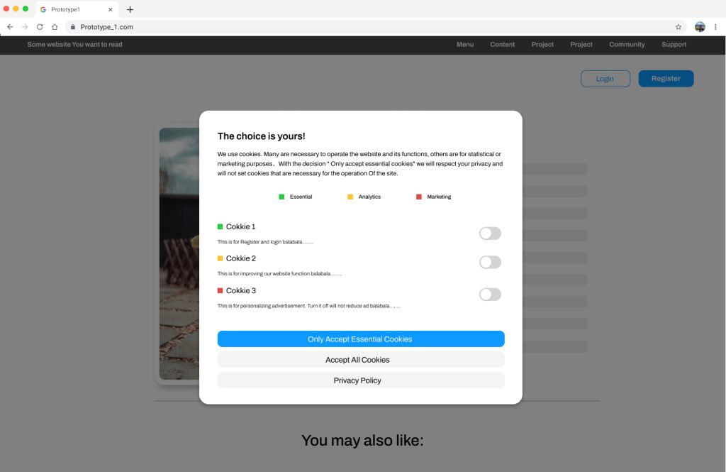
For the first prototype, there is still a pop-up window, but with much more detailed control of cookie settings. Cookies are divided into three types: essential, analysis, and marketing so that users know exactly how each one works and can obtain full control over them. I suppose this will bridge the gulf of execution.
Besides, to let users feel that they are not being forced to make these settings, I changed the title to “Choice is yours!”.
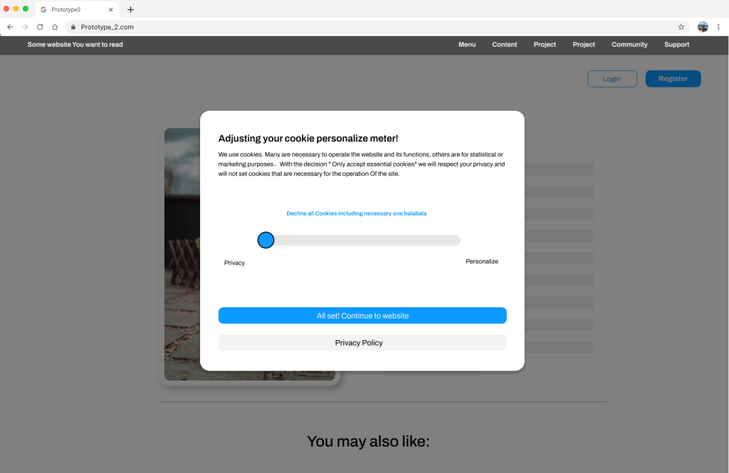
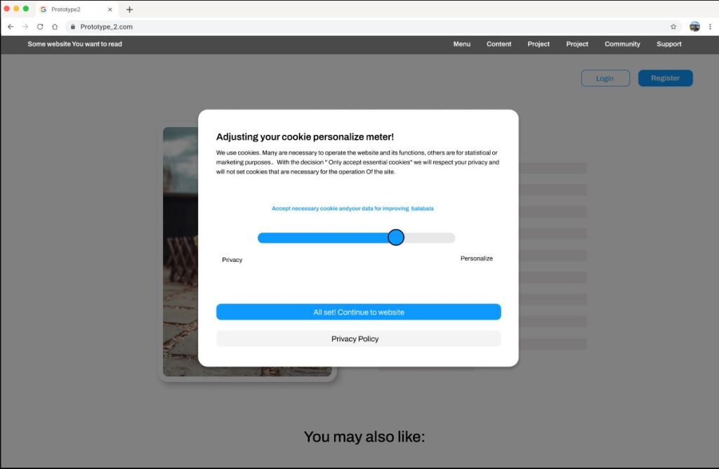
For the second prototype, a pop-up window appears first, but instead of the settings of each cookie, a slider bar for privacy and functions is displayed. This serves as a privacy meter that users can drag freely. An explanation of what users will get from this setting will appear as they drag the slider bar. By changing the way they interact, it will make the decision intuitive and easy
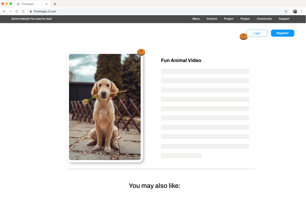
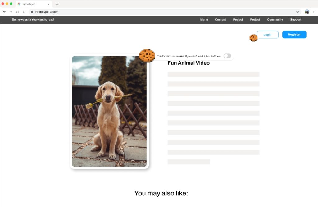
For the third prototype, I canceled the pop-up window, allowing users to access the page directly without any disruption. Instead, a small indicator of cookies appears beside the page elements that require cookies, such as the register button, images, and personalized advertisements. This approach makes the interface less intrusive, minimizing disruption for users while they complete their tasks. Additionally, it is easy and direct to manipulate, with each icon corresponding to an element that users can adjust at any time.
This assessment will be conducted via an online survey. Participants will first watch a demonstration video of the prototype, then click on the prototype link to experience it themselves. Subsequently, users will be asked to answer some questions. Since our survey requires more time commitment, I aim to keep the questions simple and straightforward to ensure response rates.
The questions will include users’ preferences for each model and reasons, their favorite model, as well as additional suggestions. I expect to receive approximately 20 responses, including both qualitative and quantitative data (see Appendix 12.5: Evaluation Survey).
These likes and dislikes will be quantified as evaluations of each feature according to the following rules (see Table 1). For open-ended questions, I will categorize them into three types: strengths, weaknesses, and suggestions. This categorization will help identify the advantages, drawbacks, and areas for improvement of the prototypes.
| Preference | Score |
|---|---|
| Strongly dislike | -2 |
| Dislike | -1 |
| Neutral | 0 |
| Like | 1 |
| Strongly Like | 2 |
The evaluation of the three prototypes was conducted through asynchronous online surveys, involving a total of 19 participants. Half of the participants were family members and friends, while the other half were students from the HCI course. Efforts were made to include the same group of individuals who filled out the previous survey on this topic (see Appendix 12.7: Evaluation Results).
Quantitative Outcome:
Pros:
Cons:
Quantitative Outcome:
Pros:
Cons:
Quantitative Outcome:
Pros:
Cons:
Among the prototypes:
Reasons for Preference:
First Prototype:
Third Prototype:
Additional Opinions:
Overall, the evaluation showed a preference for the first and third prototypes due to their simplicity, reduced intrusiveness, clear indicators, and controllability. Combining these two prototypes could effectively address their individual disadvantages and lead to a better solution. Additionally, I am considering using a notification window instead of a pop-up window to further reduce the impact on the website browsing experience.
In the results, I have indicated users’ preferences for each prototype as well as their evaluations. It’s evident that Prototype 1 and Prototype 3 received higher scores and more user preference. The positive feedback highlights factors such as:
Both prototypes received favorable ratings, with users suggesting that these two could be combined. I believe this is a great idea. Prototype 1’s detailed simplicity can compensate for the shortcomings of Prototype 3, while Prototype 3’s seamless integration and adjustable settings can address the limitations of Prototype 1.
In the final prototype development, I plan to incorporate both approaches.
There are several points to consider regarding undiscovered user needs:
Window Presentation:
Cookie Icon Disruption:
Integration of Prototypes:
A new round of brainstorming will be conducted to find suitable solutions for these issues, contributing to the development of the final prototype. Afterward, I will create more comprehensive middle-fidelity models using Figma and carry out another round of evaluation.
The core problem of the second round of brainstorming is: “Combine the two prototypes and attempt a less intrusive pop-up method with the possibility to change settings at any time.”
My plan is to start with independent brainstorming, noting down one-sentence bullet points. Then, I will explain the objectives and purpose to ChatGPT and ask for extended ideas. Finally, I will examine each viewpoint and define the final prototype. I have chosen a combination of the Gentle Fade-In Modal and the Corner Button Widget method (see Appendix 12.8: Re-Brainstorming Results).
The gentle fade-in modal is a subtle and non-intrusive way to present cookie preferences to users. When a user visits a webpage, a modal window fades into view after a short delay, often accompanied by a soft animation or transition effect. This modal contains information about cookie usage on the site and provides options for managing preferences. The gentle fade-in ensures that the modal doesn’t abruptly disrupt the user’s browsing experience while still drawing attention to the importance of managing cookies. Once the user interacts with the modal or makes their preferences known, it fades out smoothly, allowing them to continue browsing without distraction.
The corner button widget method involves placing a small, unobtrusive button or icon in one of the corners of the webpage, typically the bottom-right corner. This button serves as a discreet entry point for accessing cookie settings. When clicked or tapped, it triggers the display of a compact panel or menu containing options for managing cookie preferences. By positioning the button in a corner, it remains out of the way of the main content, minimizing visual clutter. Additionally, users can easily locate and interact with the button, as it consistently appears in the same location across different pages of the website. This approach ensures that users have convenient access to cookie controls without disrupting their browsing experience.
The changes made to the final prototype are as follows:
Non-Intrusive Interface:
User Empowerment:
Interactive Elements:
Traditional Setting Options:
The final prototype’s interaction interface is designed based on several principles of human-computer interaction, mainly including:
Simplicity:
Mapping:
Perceptibility:
Flexibility:
The evaluation of the final prototype was conducted through asynchronous online surveys, with a total of 21 participants. Half of the participants were my family members and friends, while the other half were students from the HCI course. I attempted to locate the same group of individuals who filled out the previous survey (see Appendix 12.11: Final Evaluation Survey).
Q1: The way of pop-up is less disturbing to web browsing.
The average score is 1.15, indicating that most participants believe that pop-up windows are not too disturbing for web browsing. The standard deviation is 0.895, suggesting some degree of disagreement among participants, but overall, there is a certain level of consistency.
Q2: The categorization of cookies was helpful to understand what they do.
The average score is 1.047, indicating that most participants believe that categorizing cookies helps understand their function. The standard deviation is 0.931, suggesting some degree of disagreement among participants, with some possibly believing that categorization does not help much.
Q3: The cookie icons provide a good indication as a signifier.
The average score is 1.1, indicating that most participants believe that cookie icons provide good indicators. The standard deviation is 0.727, indicating relatively consistent agreement among participants regarding the recognition of cookie icons.
Q4: It is easy and intuitive to change different settings.
The average score is 1.15, indicating that most participants believe that changing different settings is easy and intuitive. The standard deviation is 0.757, suggesting some degree of consistency among participants, but some may find changing settings not as straightforward.
Q5: I can easily tell what the current state of the setting is.
The average score is 1.15, indicating that most participants believe they can easily know the current state of settings. The standard deviation is 0.863, suggesting some differences in the perception of the current setting state among participants, but overall, there is a relatively consistent understanding.
Q6: Overall, I prefer the new interface over the cookie pop-ups.
The average score is 1.1, indicating that most participants prefer the new interface over cookie pop-up windows. The standard deviation is 0.612, suggesting a relatively consistent viewpoint among participants regarding overall preference.
Based on user comments, the advantages and disadvantages of the model are as follows. The majority of the comments express positive sentiments, highlighting the convenience, enjoyment, and effectiveness of the features provided. However, there is a minor concern regarding the granularity of displaying individual cookies.
Pros:
Cons:
The suggestions participants left can be summarized as follows. The comments reflect a variety of perspectives, including usability preferences, technical considerations, user habits, and suggestions for improvement in the prototype’s design and functionality.
Overall, the final prototype integrates the strengths of the first and third models from the previous round and has received positive feedback. Participants appreciate its simplicity, intuitiveness, and ease of use. However, experienced experts have raised practical issues, such as the granularity of cookie options and challenges for developers. If there is another round of development, considering perspectives from website operators and developers may yield different insights.
| Questions | Strongly Agree | Agree | Neutral | Disagree | Strongly Disagree |
|---|---|---|---|---|---|
| 3. Less disturbing | 5 | 12 | 2 | 2 | 0 |
| 4. Categorization is helpful | 7 | 9 | 4 | 1 | 0 |
| 5. Icons are a good indication | 4 | 10 | 3 | 4 | 0 |
| 6. Intuitive to change settings | 9 | 7 | 3 | 2 | 0 |
| 7. Easily tell what the current state | 5 | 10 | 4 | 2 | 0 |
| 8. Prefer the new interface | 6 | 12 | 2 | 1 | 0 |
This is a Navigator for my CS Practice.
zixiongwan@gmail.com